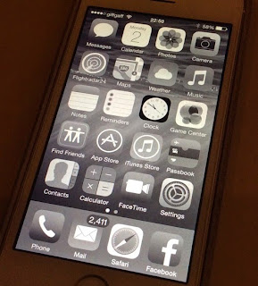
É provável que a equipa de acessibilidade da Apple já tivesse esta ideia em carteira, mas a 1 de dezembro de 2013 escrevi o email, cuja imagem deixo abaixo e que tinha o texto que se segue:
Assunto: Suggestion: a black & white interface to iOS 7
Hi,
After using iOS 7 (in a iPhone 5s) for a month, I can say that the new interface is hard to use to me. The main reason is because it isn’t consistent in the colors it use in some key elements.
For example:
- the dial keypad is background white with thin black text. To dial the number, I need to invert the colors (if I don’t do this, it’s impossible for me to see any number on it). Then, the next keypad of this call sequence (the keypad to change microphone/outloud; get a number keyboard to execute some tasks, …) is background black and text white. So, to use it I need to turn off the invert color again.
- I saw that the qwerty keyboard also change color of background/color in some situations. The pattern isn’t always the same, and in some cases either the invert color is difficult to see.
Two suggestions:
1)
To avoid these kind of situations, don’t you want to introduce in the Vision parameters, the black & white interface? This could help some users.
2)
And please be more consistent in the colors combinations of some key elements!!
note: I’m using all the features you have to improve the contrast, enlarge the pixels of letters, etc.
Thanks,
Jorge
É curioso, não é? Já agora, quando o iOS 8 sair, vamos ver se eles respeitaram as minhas 2 propriedades sugeridas :-) . Podiam ter-me enviado um brinde... algo como um disco, vá uma música do iTunes. É só uma sugestão! :-)

